
If you work in a higher education data team, there is a reasonable chance your institution is having, has recently had, or is about to have a conversation about which visualisation tool to use. There is also a reasonable chance that conversation is either going nowhere, going in circles, or heading toward a decision driven primarily by which tool someone in IT already has a licence for.
This post is for data teams who want to approach that conversation more deliberately – and who need to make a coherent case to senior leadership about why the choice matters and how to make it well.
First: why does it matter which tool you pick?
Visualisation tools are not interchangeable. The choice you make will shape what your analysts can build, what your staff can actually use, how much your institution spends over time, and – most importantly – whether data becomes genuinely accessible to people who aren’t data specialists.
That last point is the one that tends to get underweighted in procurement decisions. A tool that your data team loves but that frontline staff find baffling has not solved your data accessibility problem. It has just moved it one step downstream.
The goal of a good visualisation tool in a HE context is not impressive dashboards for the data team. It is giving a head of department, a student services manager, or a senior leader the ability to answer their own questions with data – confidently, without needing to submit a request and wait a week.
That changes what you should be optimising for.
The framework: five questions to answer before you decide
1. Who are your primary users – and what will they actually do?
This is the question most institutions skip straight past, and it is the most important one.
Your data team will almost certainly not be the primary users of the dashboards you build. The primary users will be staff across your institution – registry, student services, finance, academic departments – many of whom have limited data confidence and no appetite for learning a complex tool.
Before evaluating any product, map your user groups. Who needs read-only access to existing dashboards? Who needs to explore and filter data themselves? Who needs to build their own reports? The answers will shape almost every other decision you make.
A tool that requires meaningful training before a non-technical user can do anything useful is a tool that will see low adoption, regardless of how powerful it is.
2. Where does your data live – and how does the tool connect to it?
A visualisation tool is only as useful as its ability to connect reliably to your data sources. In a typical HE institution, that might include a student record system, a finance system, HR data, estates data, and various departmental spreadsheets that have accumulated over years.
Questions to ask at this stage include: does the tool connect natively to your existing systems, or will you need intermediate data infrastructure to make it work? How does it handle live data versus scheduled refreshes? What happens when a data source changes structure – does the dashboard break gracefully or catastrophically?
This is also the stage to be honest about your data maturity. If your underlying data is poorly structured or inconsistently maintained, a more capable tool will not fix that – it will just make the mess more visible, faster.
3. What are the total costs – not just the licence fee?
Licence costs are the visible part of the iceberg. The less visible parts include implementation time, staff training, ongoing maintenance, the cost of rebuilding reports when you upgrade, and the internal resource needed to keep everything running.
Some tools are inexpensive to licence but expensive to implement and maintain. Others have higher upfront costs but significantly lower ongoing overhead. A tool that requires a specialist developer to build and maintain every dashboard has a very different total cost profile from one that a trained analyst can manage day-to-day.
For senior leadership conversations, it is worth modelling this across a three to five year horizon rather than presenting year-one costs only. The difference is often significant enough to change the decision.
4. How does it handle governance, access control, and data sensitivity?
In a higher education context, your dashboards will almost inevitably contain data that is sensitive – student data, staff data, financial data, data subject to GDPR obligations. Your visualisation tool needs to be able to enforce appropriate access controls: making sure that a department head can see their own data but not someone else’s, that student-level data is not accidentally exposed in a summary view, and that you have an auditable record of who has access to what.
This is not just a technical requirement. It is a data governance requirement, and it should be a non-negotiable part of your evaluation criteria.
Questions to ask: does the tool support row-level security – the ability to show different users different subsets of the same data? How are access permissions managed and reviewed? Does it integrate with your existing identity management systems?
5. What does good adoption actually look like – and how will you get there?
The best tool in the world will sit unused if people do not know it exists, do not know how to use it, and do not trust the data it shows them.
Build adoption planning into your evaluation from the start. Questions worth asking include: what training and support does the vendor provide? What does the self-service documentation look like? Are there active user communities? And – critically – how easy is it for a non-technical user to get help when something doesn’t make sense?
For senior leadership, framing this upfront demonstrates that you are thinking about value realisation, not just procurement. The investment in a tool is only worthwhile if people use it.
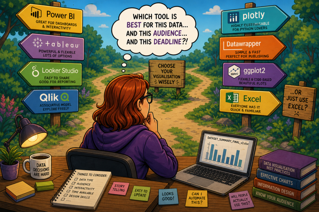
Weighing up the major tools – what to look for and where they differ
Rather than ranking tools, it is more useful to understand the dimensions on which they meaningfully differ, with examples from the tools most commonly encountered in HE.
Ease of use for non-technical users
This is where tools diverge most visibly. Some are designed around the assumption that users will want to explore and build their own views; others are primarily authoring tools for data teams, with end users consuming fixed dashboards.
Power BI, for example, sits in the Microsoft ecosystem and benefits from familiarity for staff already using Teams and SharePoint – which lowers the adoption barrier considerably in institutions already on Microsoft 365. Tableau has a strong reputation for visual flexibility and intuitive exploration for moderately data-confident users, but has a steeper learning curve for those who are less confident. Looker Studio is free to use and straightforward for simple dashboards, but has meaningful limitations when data complexity increases.
Integration with your existing stack
If your institution is predominantly Microsoft, Power BI‘s native integration with the M365 ecosystem – including direct connections to SharePoint, Teams, and Azure – is a genuine advantage that reduces both implementation complexity and ongoing friction. If you are in a more mixed or cloud-agnostic environment, tools like Tableau or Qlik may offer more neutral connectivity.
Governance and access control
Most enterprise-grade tools support row-level security, but the complexity of implementing it varies significantly. Power BI’s row-level security is well-documented but requires careful setup. Looker (the enterprise product, distinct from Looker Studio) has governance and access control built more deeply into its architecture, which can reduce the ongoing maintenance burden in complex environments.
Cost profile
Power BI is often the most cost-effective starting point for institutions already in the Microsoft ecosystem, as licences may already be included in existing agreements. Tableau and Qlik tend to carry higher per-seat costs but offer more flexibility at the high end. Looker Studio is free but the paid Looker product is enterprise-priced. It is worth auditing what you already have before starting an evaluation – institutions frequently discover they own licences they are not using.
Scalability and long-term fit
A tool that works well for ten dashboards and fifty users may create significant technical debt at a hundred dashboards and five hundred users. Think about where your institution realistically wants to be in three years, not just where you are now.
Making the case to senior leadership
Data teams sometimes make the mistake of pitching a visualisation tool as a technology decision. It is not. It is a strategic decision about how your institution uses data to make better decisions, and the case should be made in those terms.
A compelling senior leadership pitch covers four things:
- The problem you are solving – not “we need a better tool” but “staff across the institution are unable to answer basic data questions without requesting analyst time, which is creating delays and reducing data-informed decision making”
- The cost of doing nothing – analyst time spent on ad hoc reporting, decisions made on gut instinct because data is inaccessible, duplication of effort across departments
- The total investment – licence, implementation, training, and ongoing maintenance over three to five years, not just year one
- What success looks like – specific, measurable outcomes such as reduction in ad hoc report requests, increase in self-service dashboard usage, or time saved in specific reporting cycles
Framed this way, the conversation stops being about which product to buy and starts being about how data capability supports institutional strategy. That is a much easier conversation to have at senior level – and a much harder one to deprioritise.
Helping higher education institutions think through data strategy, tooling decisions, and the governance frameworks that sit around them is a core part of what Sparkline does. If your institution is navigating a visualisation tool decision and you would like a sounding board, feel free to get in touch.