When working with sensitive datasets in Power BI, it’s common to need more than just a “neat” presentation of numbers. Sometimes you need to apply privacy-preserving techniques—like rounding or suppressing small counts—to protect individuals’ identities while still providing useful aggregated insights.
This is especially relevant in higher education, healthcare, and other sectors where data can be disclosive at low counts.
In this post, I’ll walk through a practical example:
- Rounding totals to the nearest 5
- Suppressing totals below a certain threshold (in this case, 22.5)
The Scenario
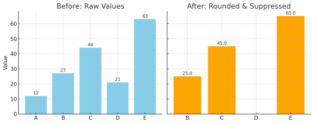
Imagine you’re working with student-level data—perhaps enrolments, completions, or survey responses. Your visualisations are summarised at a group level, but you need to make sure individual data points can’t be identified.
Two key requirements:
- Round aggregated totals to the nearest multiple of 5
- Suppress totals that are less than 22.5
Step 1 – Understanding the Functions
Power BI uses DAX (Data Analysis Expressions) to create measures that calculate results dynamically.
For this task we’ll use:
MROUND()– rounds a number to the nearest multiple of another numberIF()– applies conditional logicBLANK()– hides values in visualsSUM()– calculates totals across the current filter context
Step 2 – Writing the Measure
Here’s a DAX measure that combines both rounding and suppression:
DAXCopyEditRoundedAndSuppressedMeasure =
    VAR TotalValue = SUM('Table'[OriginalValue])
    RETURN
        IF(
            TotalValue < 22.5,
            BLANK(),
            MROUND(TotalValue, 5)
        )
Step 3 – How It Works
- Calculate the total
TheVARstores the total for the current filter context (e.g., per category or time period). - Apply suppression
If the total is less than 22.5, the measure returnsBLANK(). In most visuals, this means nothing is displayed, preventing small counts from appearing. - Apply rounding
If the total passes the threshold,MROUND()rounds it to the nearest multiple of 5 before displaying.
Step 4 – Using It in Your Report
Once created, use this measure in your visuals instead of the original field. This ensures every chart and table benefits from the same logic automatically.
For example:
- A bar chart will omit low values entirely
- A table will show rounded numbers instead of precise counts
Why This Matters
Beyond making charts look tidy, this approach addresses data privacy and statistical disclosure control. It’s a simple but effective way to reduce the risk of identifying individuals from aggregated results—without needing complex data masking tools.
In my experience, techniques like this are invaluable when sharing dashboards with wider audiences, publishing reports, or complying with regulatory requirements.
Final Thoughts
Power BI is more than just a visualisation tool—it’s a platform where you can embed governance and privacy rules directly into your analysis layer.
By combining DAX logic with a good understanding of your data protection needs, you can deliver dashboards that are both insightful and compliant.
If you regularly work with sensitive datasets and want to build in suppression, rounding, or other privacy controls in Power BI, I can help you design robust, scalable solutions that protect your data without compromising on insight. If you want to learn more about Power BI, check out my training course.